BBBYond a stupid layout
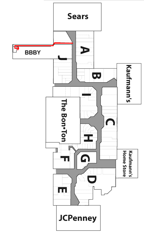
I haven’t blogged at all about Hamburg recently, so here’s one that’s been bugging me. What braniac came up with the layout of the new Bed Bath and Beyond at the McKinley mall? Pretty much every store in the mall has an entrance from the mall. That’s kind of the point. Some have exterior entrances as well. Not for the brand new BBBY, they apparently forgot they were in the mall. The store has an exterior entranceway and a hallway that runs the entire length of the store to the mall. So if you’re in the mall and want to enter BBBY, you have to do this:

(may not be exactly to scale – the mall’s website hasn’t added BBBY to it’s map yet, so I estimated)
Now, there’s a display window in the mall hallway where they could have easily put a doorway, but they didn’t. My only guess is that because this BBBY is smaller than their other locations, they didn’t want to give up any space for another set of registers (or didn’t want to have to pay more cashiers). The store actually feels too small to me. Everything’s packed in there floor to ceiling. I’m surprised that the mall would have let them build the store like that, or that BBBY would want to. Not an enjoyable navigating or shopping experience.
AMEN! Then again, you really got this from me anyway! :p
True, you were first to experience it. But I beat you to the blog. 😉
Yeah, but I made you count 8,000 pictures with mine! 😉 😉